Items Similar to "Mankind, " Intaglio on Digital Inkjet Graphic signed by Suzanne McClelland


Want more images or videos?
Request additional images or videos from the seller
1 of 11
Suzanne McClelland"Mankind, " Intaglio on Digital Inkjet Graphic signed by Suzanne McClelland2004
2004
About the Item
"Mankind" is an original one-color intaglio print over an 8-color digital pigmented inkjet graphic by Suzanne McClelland. The artist signed the piece lower right. It features blue gestural marks over a multicolored, uneven script that says "Stud".
15 1/4" x 13 7/8" image
24 1/4" x 20 1/2" paper
27" x 23 3/4" frame
Suzanne McClelland has exhibited extensively in the United States and abroad since the early 1990s. Her practice includes large-scale paintings, works on paper and books, often extracting fragments of speech or text from various political or cultural sources and exploring the social, symbolic and material possibilities that reside within language.
“McClelland’s pictures find their genesis in textual elements -- words and numbers. The artist considers writing as a form of drawing, especially as handwriting falls increasingly out of use, almost entirely replaced by typing. Her method of writing is born of careful listening, tethering sounds to language. The paintings seek to fill the perceptional gap between what she hears and what she reads. The artworks are synesthetically representational -- portrayals of the mechanical and verbal languages that permeate our surroundings. McClelland is conscious of her paintings’ two-dimensionality and the particular kind of reading it necessitates. They showcase a keen but unorthodox sense of form: one which resists the lure of beauty, employing interruptions in formal fluidity to develop a particular breed of legibility. They find part of their appeal in this difficulty: the abruptness, the willingness to obscure a piece of text or a shape, allowing the artist’s heard language to come to visual life. We rely on numbers to provide us with a sense of order, to give shape and meaning to something otherwise difficult to comprehend fully. These pictures explore the ways in which numbers and words affect and relate to human lives, particularly in light of the recent collapse of faith in facts, when mathematical projections and language itself are questioned.” (TB for team gallery, inc. 2013)
McClelland has participated in the 1993 and 2014 Whitney Biennials and has been the subject of solo presentations at The Aldrich Museum of Contemporary Art, curated by Amy Smith-Stewart; The University of Virginia Museum of Art, curated by Jennifer Farrell; and The Whitney Museum of American Art, Philip Morris branch, curated by Thelma Golden. Her paintings are held in numerous public collections, including The Museum of Modern Art, The Metropolitan Museum of Art, The Brooklyn Museum, The Yale University Art Gallery, The Albright-Knox Gallery, and The Walker Art Center.
She currently teaches as a Mentor in the Department of Visual Arts at Columbia University. She has been a faculty member in the Masters of Fine Arts program at the School of Visual Arts since 1997 and has been on the Board of Governors at the Skowhegan School of Painting and Sculpture since 1999. Recent publications include monograph “Suzanne McClelland: 36-24-36” with an essay contribution by Thierry de Duve, published by team gallery, inc. in 2016 and distributed by D.A.P., as well as “Knock Knock” and "Net Worth", both published by Space Sisters Press in 2018 with a text contribution for the latter by Amy Smith-Stewart.
- Creator:Suzanne McClelland (1959, American)
- Creation Year:2004
- Dimensions:Height: 27 in (68.58 cm)Width: 23.75 in (60.33 cm)
- Medium:
- Movement & Style:
- Period:
- Condition:
- Gallery Location:Milwaukee, WI
- Reference Number:
About the Seller
4.9
Platinum Seller
These expertly vetted sellers are 1stDibs' most experienced sellers and are rated highest by our customers.
Established in 1966
1stDibs seller since 2017
392 sales on 1stDibs
Typical response time: 2 hours
- ShippingRetrieving quote...Ships From: Milwaukee, WI
- Return PolicyA return for this item may be initiated within 14 days of delivery.
More From This SellerView All
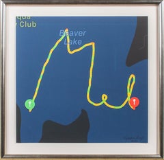
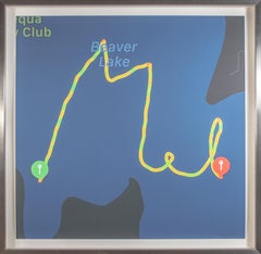
- 'Mel Swimming in Beaver Lake (Blue)' original digital artwork by Melodee LieglLocated in Milwaukee, WI'Mel Swimming in Beaver Lake (Blue)' is an original digital artwork by Wisconsin-based artist and swimmer Melodee Liegl – the first digital artist represented by our gallery! As a pr...Category
2010s Contemporary Abstract Prints
MaterialsDigital Pigment
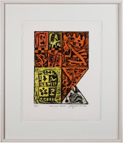
- "Animal Farm" from 'Los Animales Portfolio, " Collagraph signed by Joseph RozmanBy Joseph RozmanLocated in Milwaukee, WI"Animal Farm" is an original color collagraph by Joseph Rozman. This artwork, edition number 9/10, is from the artist's "Los Animales" portfolio. The artist signed, titled, dated, an...Category
1960s Pop Art Abstract Prints
MaterialsColor, Pigment
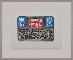
- "Red Devil" from "Los Animales" Portfolio, Collagraph signed by Joseph RozmanBy Joseph RozmanLocated in Milwaukee, WI"Red Devil" is an original color collagraph from the "Los Animales" portfolio by Joseph Rozman. The artist signed, dated, titled, and editioned the artwork below the image. It is num...Category
1960s Pop Art Animal Prints
MaterialsColor, Pigment
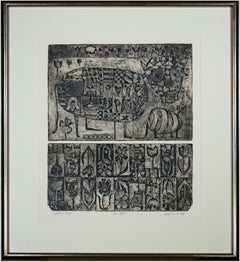
- "Mi Gato, " Rare Black & White Pattern Collagraph AP signed by Joseph RozmanBy Joseph RozmanLocated in Milwaukee, WI"Mi Gato" is an original collagraph by Joseph Rozman. The artist signed, dated, and titled the artwork below the image. This artwork is the artist's proof. This artwork features an a...Category
1960s Pop Art Animal Prints
MaterialsBlack and White, Pigment
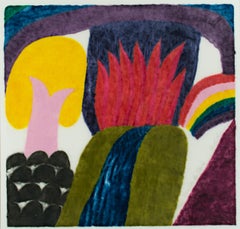
- "Pura Vida" original color woodcut print signed by Carol SummersBy Carol SummersLocated in Milwaukee, WI"Pura Vida" is an original color woodcut signed by Carol Summers. A multi-colored piece shows a waterfall with red flames behind it in the middle of the piece. On the left stands a tree with yellow leaves on a hill. To the right is a rainbow. This is an excellent example of Summer's printmaking, not just because of the technique and imagery, but because it numbered 1 of the edition of 125. In addition, it contains a personal inscription to the Milwaukee gallerist David Barnett, who has championed the work of Summers and produced catalogs of his work. Indeed, this print appears as no. 189 in the David Barnett Gallery's 1988 catalogue raisonné of Summer's woodcuts. Feel free to inquire if you would like to purchase a copy of the catalogue raisonné along with your Carol Summers print. Art: 24.25 x 24.75 in Frame: 36 x 35 in signed lower right titled and inscribed to David [Barnett] lower right edition (1/125) lower right Carol Summers (1925-2016) has worked as an artist throughout the second half of the 20th century and into the first years of the next, outliving most of his mid-century modernist peers. Initially trained as a painter, Summers was drawn to color woodcuts around 1950 and it became his specialty thereafter. Over the years he has developed a process and style that is both innovative and readily recognizable. His art is known for it’s large scale, saturated fields of bold color, semi-abstract treatment of landscapes from around the world and a luminescent quality achieved through a printmaking process he invented. In a career that has extended over half a century, Summers has hand-pulled approximately 245 woodcuts in editions that have typically run from 25 to 100 in number. His talent was both inherited and learned. Born in 1925 in Kingston, a small town in upstate New York, Summers was raised in nearby Woodstock with his older sister, Mary. His parents were both artists who had met in art school in St. Louis. During the Great Depression, when Carol was growing up, his father supported the family as a medical illustrator until he could return to painting. His mother was a watercolorist and also quite knowledgeable about the different kinds of papers used for various kinds of painting. Many years later, Summers would paint or print on thinly textured paper originally collected by his mother. From 1948 to 1951, Carol Summers trained in the classical fine and studio arts at Bard College and at the Art Students League of New York. He studied painting with Steven Hirsh and printmaking with Louis Schanker. He admired the shapes and colors favored by early modernists Paul Klee (Sw: 1879-1940) and Matt Phillips (Am: b.1927- ). After graduating, Summers quit working as a part-time carpenter and cabinetmaker (which had supported his schooling and living expenses) to focus fulltime on art. That same year, an early abstract, Bridge No. 1 was selected for a Purchase Prize in a competition sponsored by the Brooklyn Museum. In 1952, his work (Cathedral, Construction and Icarus) was shown the first time at the Museum of Modern Art in New York City in an exhibition of American woodcuts. In 1954, Summers received a grant from the Italian government to study for a year in Italy. Woodcuts completed soon after his arrival there were almost all editions of only 8 to 25 prints, small in size, architectural in content and black and white in color. The most well-known are Siennese Landscape and Little Landscape, which depicted the area near where he resided. Summers extended this trip three more years, a decision which would have significant impact on choices of subject matter and color in the coming decade. After returning from Europe, Summers’ images continued to feature historical landmarks and events from Italy as well as from France, Spain and Greece. However, as evidenced in Aetna’s Dream, Worldwind and Arch of Triumph, a new look prevailed. These woodcuts were larger in size and in color. Some incorporated metal leaf in the creation of a collage and Summers even experimented with silkscreening. Editions were now between 20 and 50 prints in number. Most importantly, Summers employed his rubbing technique for the first time in the creation of Fantastic Garden in late 1957. Dark Vision of Xerxes, a benchmark for Summers, was the first woodcut where Summers experimented using mineral spirits as part of his printmaking process. A Fulbright Grant as well as Fellowships from the Louis Comfort Tiffany Foundation and the Guggenheim Foundation followed soon thereafter, as did faculty positions at colleges and universities primarily in New York and Pennsylvania. During this period he married a dancer named Elaine Smithers with whom he had one son, Kyle. Around this same time, along with fellow artist Leonard Baskin, Summers pioneered what is now referred to as the “monumental” woodcut. This term was coined in the early 1960s to denote woodcuts that were dramatically bigger than those previously created in earlier years, ones that were limited in size mostly by the size of small hand-presses. While Baskin chose figurative subject matter, serious in nature and rendered with thick, striated lines, Summers rendered much less somber images preferring to emphasize shape and color; his subject matter approached abstraction but was always firmly rooted in the landscape. In addition to working in this new, larger scale, Summers simultaneously refined a printmaking process which would eventually be called the “Carol Summers Method” or the “ Carol Summers Technique”. Summers produces his woodcuts by hand, usually from one or more blocks of quarter-inch pine, using oil-based printing inks and porous mulberry papers. His woodcuts reveal a sensitivity to wood especially its absorptive qualities and the subtleties of the grain. In several of his woodcuts throughout his career he has used the undulating, grainy patterns of a large wood plank to portray a flowing river or tumbling waterfall. The best examples of this are Dream, done in 1965 and the later Flash Flood Escalante, in 2003. In the majority of his woodcuts, Summers makes the blocks slightly larger than the paper so the image and color will bleed off the edge. Before printing, he centers a dry sheet of paper over the top of the cut wood block or blocks, securing it with giant clips. Then he rolls the ink directly on the front of the sheet of paper and pressing down onto the dry wood block or reassembled group of blocks. Summers is technically very proficient; the inks are thoroughly saturated onto the surface of the paper but they do not run into each other. The precision of the color inking in Constantine’s Dream in 1969 and Rainbow Glacier in 1970 has been referred to in various studio handbooks. Summers refers to his own printing technique as “rubbing”. In traditional woodcut printing, including the Japanese method, the ink is applied directly onto the block. However, by following his own method, Summers has avoided the mirror-reversed image of a conventional print and it has given him the control over the precise amount of ink that he wants on the paper. After the ink is applied to the front of the paper, Summers sprays it with mineral spirits, which act as a thinning agent. The absorptive fibers of the paper draw the thinned ink away from the surface softening the shapes and diffusing and muting the colors. This produces a unique glow that is a hallmark of the Summers printmaking technique. Unlike the works of other color field artists or modernists of the time, this new technique made Summers’ extreme simplification and flat color areas anything but hard-edged or coldly impersonal. By the 1960s, Summers had developed a personal way of coloring and printing and was not afraid of hard work, doing the cutting, inking and pulling himself. In 1964, at the age of 38, Summers’ work was exhibited for a second time at the Museum of Modern Art. This time his work was featured in a one-man show and then as one of MOMA’s two-year traveling exhibitions which toured throughout the United States. In subsequent years, Summers’ works would be exhibited and acquired for the permanent collections of multiple museums throughout the United States, Europe and Asia. Summers’ familiarity with landscapes throughout the world is firsthand. As a navigator-bombardier in the Marines in World War II, he toured the South Pacific and Asia. Following college, travel in Europe and subsequent teaching positions, in 1972, after 47 years on the East Coast, Carol Summers moved permanently to Bonny Doon in the Santa Cruz Mountains in Northern California. There met his second wife, Joan Ward Toth, a textile artist who died in 1998; and it was here his second son, Ethan was born. During the years that followed this relocation, Summers’ choice of subject matter became more diverse although it retained the positive, mostly life-affirming quality that had existed from the beginning. Images now included moons, comets, both sunny and starry skies, hearts and flowers, all of which, in one way or another, remained tied to the landscape. In the 1980s, from his home and studio in the Santa Cruz mountains, Summers continued to work as an artist supplementing his income by conducting classes and workshops at universities in California and Oregon as well as throughout the Mid and Southwest. He also traveled extensively during this period hiking and camping, often for weeks at a time, throughout the western United States and Canada. Throughout the decade it was not unusual for Summers to backpack alone or with a fellow artist into mountains or back country for six weeks or more at a time. Not surprisingly, the artwork created during this period rarely departed from images of the land, sea and sky. Summers rendered these landscapes in a more representational style than before, however he always kept them somewhat abstract by mixing geometric shapes with organic shapes, irregular in outline. Some of his most critically acknowledged work was created during this period including First Rain, 1985 and The Rolling Sea, 1989. Summers received an honorary doctorate from his alma mater, Bard College in 1979 and was selected by the United States Information Agency to spend a year conducting painting and printmaking workshops at universities throughout India. Since that original sabbatical, he has returned every year, spending four to eight weeks traveling throughout that country. In the 1990s, interspersed with these journeys to India have been additional treks to the back roads and high country areas of Mexico, Central America, Nepal, China and Japan. Travel to these exotic and faraway places had a profound influence on Summers’ art. Subject matter became more worldly and nonwestern as with From Humla to Dolpo, 1991 or A Former Life of Budha, 1996, for example. Architectural images, such as The Pillars of Hercules, 1990 or The Raja’s Aviary, 1992 became more common. Still life images made a reappearance with Jungle Bouquet in 1997. This was also a period when Summers began using odd-sized paper to further the impact of an image. The 1996 Night, a view of the earth and horizon as it might be seen by an astronaut, is over six feet long and only slightly more than a foot-and-a-half high. From 1999, Revuelta A Vida (Spanish for “Return to Life”) is pie-shaped and covers nearly 18 cubic feet. It was also at this juncture that Summers began to experiment with a somewhat different palette although he retained his love of saturated colors. The 2003 Far Side of Time is a superb example of the new direction taken by this colorist. At the turn of the millennium in 1999, “Carol Summers Woodcuts...Category
1980s Contemporary Abstract Prints
MaterialsWoodcut
You May Also Like
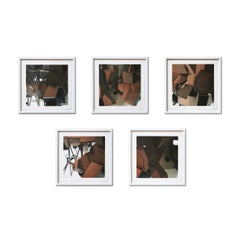
- Thomas Demand, Five Drafts (Simulator): Suite of 5 Photographs, Signed PrintsBy Thomas DemandLocated in Hamburg, DEThomas Demand (German, born 1964) Five Drafts (Simulator), 2004 Medium: Suite of 5 digital pigment prints on photo rag paper (each framed) Dimensions: each 28 x 28 cm Framed dimensio...Category
21st Century and Contemporary Contemporary Abstract Photography
MaterialsDigital Pigment
- Randal Ford - Buckley, Photography 2020, Printed AfterBy Randal FordLocated in Greenwich, CTAvailable sizes: 37.5" x 30", Edition of 15 50" x 40", Edition of 10 60" x 48", Edition of 5 Narrative: Mother Nature sure had fun with Buckley! White coat with brown spots, brown e...Category
2010s Contemporary Color Photography
MaterialsDigital Pigment, Luster, Archival Pigment, Laser, Digital, Color, C Prin...
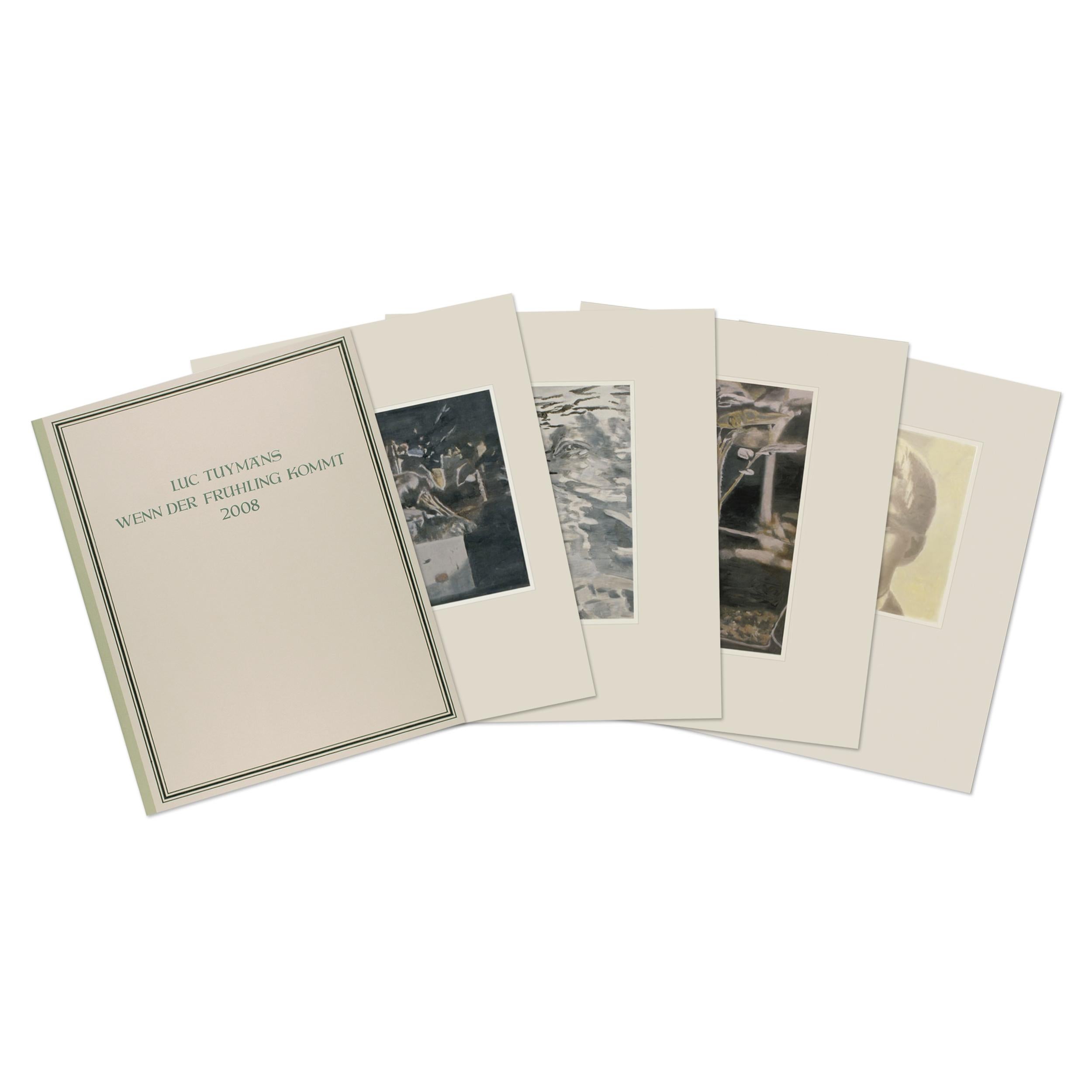
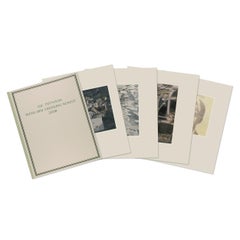
- Luc Tuymans, Wenn der Frühling kommt - Portfolio including 17 Prints, SignedBy Luc TuymansLocated in Hamburg, DELuc Tuymans (Belgian, b. 1958) Wenn der Frühling kommt, 2007 Medium: Portfolio with 17 digital pigment prints on semi-transparent paper, mounted onto heavy rag paper Dimensions: 50 x...Category
21st Century and Contemporary Contemporary Figurative Prints
MaterialsDigital Pigment
- "CALL MY BOOKIE 04042018 600pm", Abstract, Digital Print, Black and White, ArrowBy Justin NeelyLocated in Toronto, OntarioThe abstract print "CALL MY BOOKIE 04042018 600pm" is a digital artwork, created with the Brushes Redux iPhone app, and printed at 36x36" on museum-quality Canson Platine Fibre Rag 3...Category
21st Century and Contemporary Contemporary Abstract Prints
MaterialsArchival Paper, Archival Pigment, Digital Pigment
- YSL / Marrakech (Pink) by Max De FrostBy Max De FrostLocated in New York, NYYSL / Marrakech (Pink), 2019 Pigment print on Hotpress 20 x 15.5 inches Edition of 18 Publisher: Eminence Grise Editions Printer: Andre RibuoliCategory
2010s Contemporary Abstract Prints
MaterialsDigital Pigment
- "Hey Billy-Mae print", Abstract, Assemblage, Digital PrintBy Danielle CloughLocated in Philadelphia, PAThis piece titled "Hey Billy-Mae" is a digital print by Danielle Clough. This piece measures 43.5" x 43.5" and is an edition of 22. The threads that link the ancient and the modern ...Category
21st Century and Contemporary Contemporary Abstract Prints
MaterialsDigital Pigment


Recently Viewed
View AllMore Ways To Browse
Knock Knock
Printed Stud
Speech Signed
Intaglio Framed Art Works
Large Intaglios
Framed Intaglios Signed
Vintage Spats
William Turnbull
Alberti Miro
Cellini New York
Ceramiques De Picasso
Cricket Bronze
Dali Jerusalem
Girl Reading Book Vintage
James Coignard Etching
Jasper Grace
Mel Bochner Artist
Miro Lithographe Ii