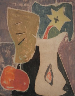
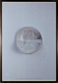
Carol Summers"Bon Apetit, " Original Black and White Woodcut by Carol Summers1966
1966
About the Item
- Creator:Carol Summers (1925 - 2016, American)
- Creation Year:1966
- Dimensions:Height: 18.25 in (46.36 cm)Width: 14 in (35.56 cm)
- Medium:
- Period:
- Condition:
- Gallery Location:Milwaukee, WI
- Reference Number:
Carol Summers
Carol Summers, one of America's foremost printmakers, was born in Kingston, New York, in 1925. After service in the Second World War in the Pacific, he attended Bard College, where he studied painting under Stefan Hirsch and printmaking with Louis Schanker. Soon after his graduation in 1951, Summers was awarded several prestigious fellowships, one from the Italian government to study in Italy in 1955, two from the Louis Comfort Tiffany Foundation in 1955 and 1960, and another from the John Simon Guggenheim Foundation in 1959. University posts and workshops took him all over the world, and his subject matter is mainly colorful, stylized landscapes of the places that were of special significance to him, such as in Italy, India and Nepal. In 1974, Summers was awarded an honorary doctorate from the Bard College. His work is in numerous prestigious museums internationally including the Museum of Modern Art, Metropolitan Museum of Art, Art Institute of Chicago, Los Angeles County Museum of Art and Accademia Degli Intronati in Siena, Italy.
- ShippingRetrieving quote...Ships From: Milwaukee, WI
- Return PolicyA return for this item may be initiated within 14 days of delivery.
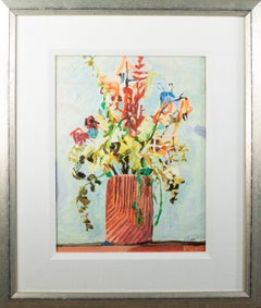
- Dried Flowers in a Stoneware Vase giclee print spring color gift decor momBy Kevin KnoppLocated in Milwaukee, WIThis giclee print on canvas is hand embellished with acrylic gel brushstrokes after the 2001 original oil painting. Depicting brightly colored flowers in a vase, this beautiful artwo...Category
2010s Contemporary Still-life Paintings
MaterialsCanvas, Acrylic, Giclée
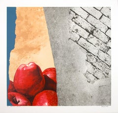
- "Boldest Native" original lithograph signed pop art abstract hyperrealistic boldBy Michael KniginLocated in Milwaukee, WI"Boldest Native" is an original color lithograph by Michael Knigin. This piece features a pile of apples with abstract textures. The artist signed the piece lower right and titled it...Category
1980s Pop Art Still-life Prints
MaterialsLithograph
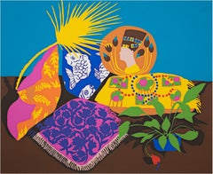
- "Anthunium, " Original Color Serigraph Colorful Still Life signed by Hunt SlonemBy Hunt SlonemLocated in Milwaukee, WI"Anthunium" is an original color serigraph by Hunt Slonem. The artist signed and dated the piece in the lower right and wrote the edition number, AP 3/30, in the lower left. This piece depicts a still life with patterned pillows and plants. 19 3/4"x 24 1/8"image 22"x 30"paper 29 1/8" x 33 1/2" frame Hunt Slonem (born Hunt Slonim, July 18, 1951) is an American painter, sculptor, and printmaker. He is best known for his Neo-Expressionist paintings of tropical birds, often based on a personal aviary in which he has been keeping from 30 to over 100 live birds of various species. Slonem's works are included in many important museum collections all over the world; he is exhibiting regularly at both public and private venues, and he has received numerous honors and awards. Hunt Slonem’s oil paintings...Category
1980s Still-life Prints
MaterialsScreen
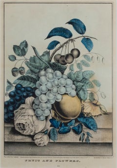
- 19th century color lithograph still life fruit flowers signedBy Nathaniel CurrierLocated in Milwaukee, WI"Fruit & Flowers" is an original hand-colored lithograph by Nathaniel Currier. It features a still life with grapes, roses, and other botanical objects. The colors are muted blues and yellows. The artist signed the piece in plate lower left. 11 3/4" x 8 1/2" art 22 1/8" x 18" frame Nathaniel Currier was born March 27, 1813 to Nathaniel and Hannah Currier in Roxbury, Massachusetts. At the age of fifteen he was apprenticed to William S. and John Pendleton of Boston who had set up the first lithographic establishment in America. His apprenticeship served him well as he went on to be the largest publisher of lithographs. Mr. Maurer described Nat Currier as being very gentlemanly and liberal. As is evident to the success of the firm of Currier & Ives he was very devoted to his business. Nat Currier had many friends including Horace Greely and P.T. Barnum. He was well known for his sense of humor and Harry T. Peters tells one story about P. T. Barnum. "Currier had heard that one day his friend, the great showman, had rushed into the barber shop of the old Park Hotel, at Beekman and Nassau Streets, to get a shave. Barnum had hurried up to Tom Higginson, the barber, and said, 'Tom, I'm in a hurry.' 'Sorry for it,' said Tom, 'but it's that gentleman's turn next.' 'That gentleman' was an unshaven irshman waiting for a ten-cent shave. Barnum turned to him and said, 'My friend, if you will let me have your turn, I'll pay for what you have done.' The gentleman consented, and, as Barnum found out later, had a full job done - absolutely everything the house had. The check was for a dollar and sixty cents. When Currier heard this story he found the very Irishman and had him pose. The result was the famous cartoon, "The Man that Gave Barnum 'His Turn.'" Nathaniel was married twice; his first wife was Miss Eliza West of Boston. He had one son with Eliza, Edward West Currier. In 1847 he married Miss Laura Ormsbee of Vermont. Laura and Nathaniel are memorialized in the famous N. Currier lithograph The Road Winter...Category
1840s Academic Still-life Prints
MaterialsLithograph
- 'Untitled' Poster Series Curated by Christophe Boutin and Mélanie ScarcigliaLocated in Milwaukee, WI26 1/4" x 18" art 28.25" x 20" frame Poster for Untitled, 2017 Poster Series Curated by Christophe Boutin and Mélanie Scarciglia for Untitled, Miami Beach, 2017.Category
2010s Still-life Prints
MaterialsDigital
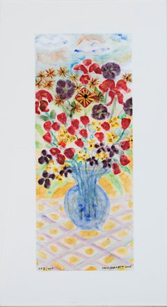
- "Blue Vase with Stonehenge Face: Tulips & Lillies, " Print signed by BarnettBy David BarnettLocated in Milwaukee, WI"Blue vase with Stonehenge Face: Tulips & Lillies" is a giclee print after the 2005 collaboration between David Barnett and Sheryl Williams. It is signed in the lower right-hand corner by David Barnett. Image: 19.74" x 7.75" Framed: 27" x 15" Framed to conservation standards. Mounted on 100% cotton fiber mat board with a 2-3/4 inch border and glazed in a UF5 Plexiglass that filters 99% of UV Rays, guaranteeing the preservation of the piece and safety during shipping. All housed in a rounded contemporary molding in a brushed aluminum finish. David Barnett, an artist, collector, appraiser and gallerist has been passionate about art from the early age of five. David’s career as an art dealer began at age nineteen when, as a fine arts student, he sponsored an exhibition of work by fellow student artists. In 1966, he opened his first gallery in a converted basement apartment at Wisconsin Avenue and 21st Street. In 1985 David moved his gallery from Wisconsin Avenue into the Old Button Mansion on State Street and has been active ever since. David’s talents for recognizing undervalued artists and for meeting the needs of art lovers, art collectors and artists have created a vibrant, flourishing gallery and collection of over 6,000 works of art. David was born and raised in Wisconsin. He has been painting in watercolors, acrylics, oil pastels as well as fine art photography. David has more than 10 different series he has developed over the years. They include Abstract, Surrealism, Morph Dog, Up North Birch Bark, Impressions of Mexico City, Southwest, Fireworks, Famous Artist Paying Homage and Garden Panorama. Influential artists include Vermeer, Miro, Kandinsky, Chagall, Nolde and Klee. David has been featured in many magazines, newspapers and public television programs regarding his beautiful gallery, collection and knowledge and passion of fine art. David also has work in the permanent collection Scottsdale Museum of Contemporary Art, Arizona. In November 2005, he opened his second studio gallery in Hartland, Wisconsin. Exhibits: “Morph Dog Series”, David Barnett Gallery, 1996 “Renewal", Art Escape Gallery, Thiensville, WI, 2003 “Recent Watercolors", David Barnett Gallery, 2003, Lora D. Art Gallery, Chicago, IL, 2004 “Group Show”, Broden Gallery Ltd., Madison, WI, May-June 2004 "Homage to Kandinsky", David Barnett Gallery, Milwaukee, WI 2014 Collections Scottsdale Museum of Contemporary Art, Scottsdale, AZ Private collections throughout the United States and around the world including collections in Wisconsin, Maryland, New York, Washington D.C., Arizona, Illinois, Florida, Kentucky. International collections in Brazil, Singapore and Hong Kong. Articles Milwaukee Journal Sentinel, "Barnett Gives His Work an Exhibit" by James Auer, November 1996 Exclusively Yours...Category
21st Century and Contemporary Post-Modern Still-life Prints
MaterialsGiclée
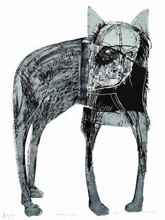
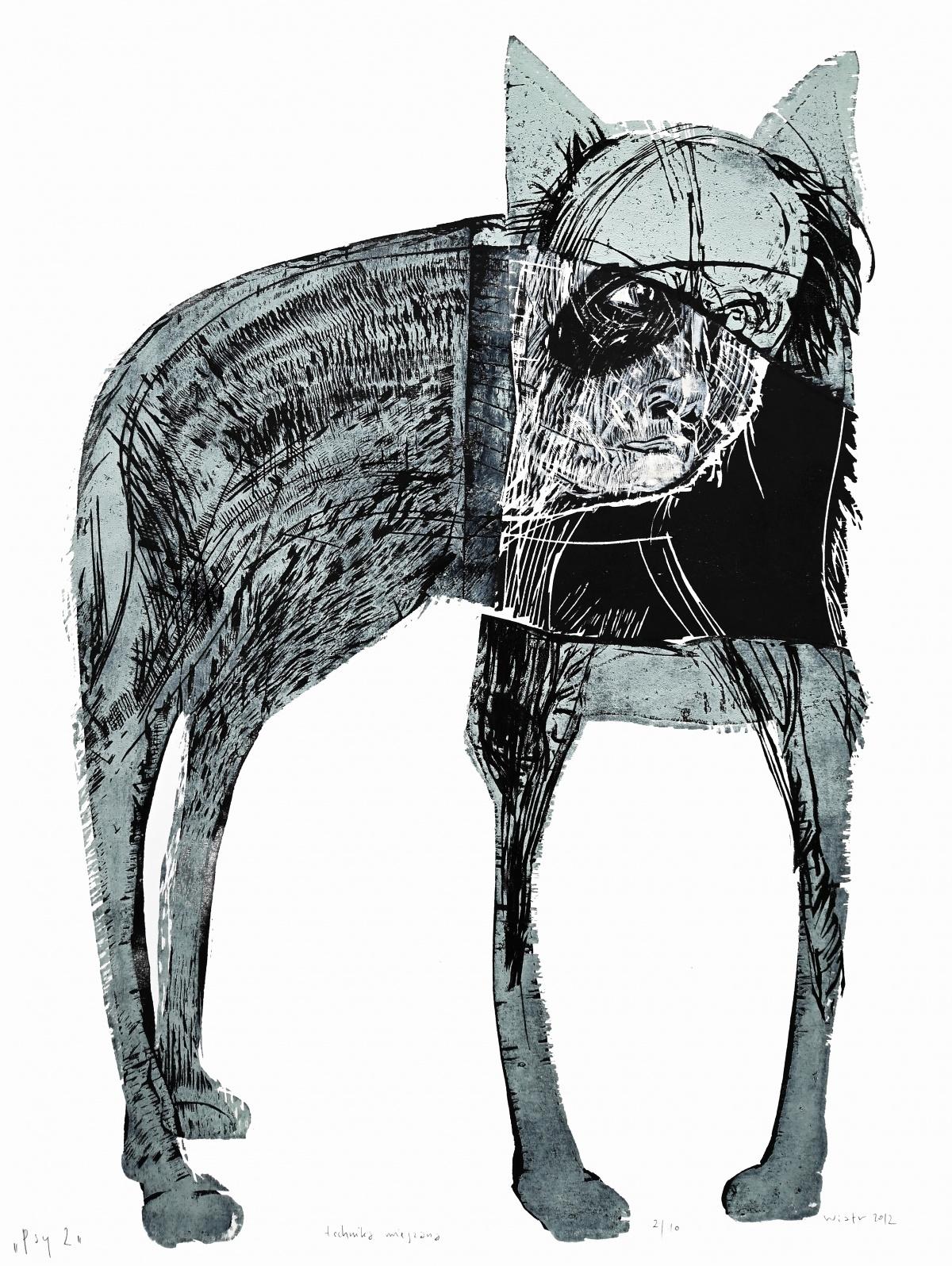
- Dogs 2 - Contemporary Woodcut Print, Figurative, Black & white, Polish artistBy Zdzislaw WiatrLocated in Warsaw, PLZDZISŁAW WIATR (born 1960) He graduated from the Academy of Fine Arts in Cracow, at the Faculty of Graphic Arts in Katowice, where in 1986 he received a diploma with the honourable m...Category
21st Century and Contemporary Contemporary Still-life Prints
MaterialsPaper, Woodcut
- Untitled, from the Art Against AIDS PortfolioLocated in New York, NYGael Stack Untitled, from the Art Against AIDS Portfolio, 1988 Woodcut on paper with deckled edges. Hand signed. Numbered. Printer's and Publisher's Blindstamp. Unframed. Hand signed and numbered on the lower recto (front) with printer's and publisher's blindstamp. Edition 38/50 20 × 15 inches Publisher Little Egypt Enterprises, Houston, TX Provenance Art Against AIDS Portfolio, numbered 38/50 This beautiful limited edition woodcut by Gael Stack was published in 1988 as part of the Art Against Aids portfolio, numbered 38/50. Superb provenance as it is was acquired from the original Art Against AIDS Portfolio published in Houston, Texas. This will be the first time the work will be removed from the portfolio. The late 1980s was the height of the AIDS epidemic, and this was one of many efforts by the creative community to raise funds to assist in fighting this deadly scourge that disproportionately affected the artistic community. Measurements: 20 x 15 inches (sheet) 8 1/4 x 12 inches(image) The complete Art Against AIDS Portfolio is comprised of 10 prints, in black and white and color, from 10 artists. About Gael Stack: Gael Stack is a Texas painter. She lives in Houston and has work in the permanent collections of several museums. Stack has worked as a professor at the University of Houston...Category
1980s Contemporary Figurative Prints
MaterialsPencil, Woodcut
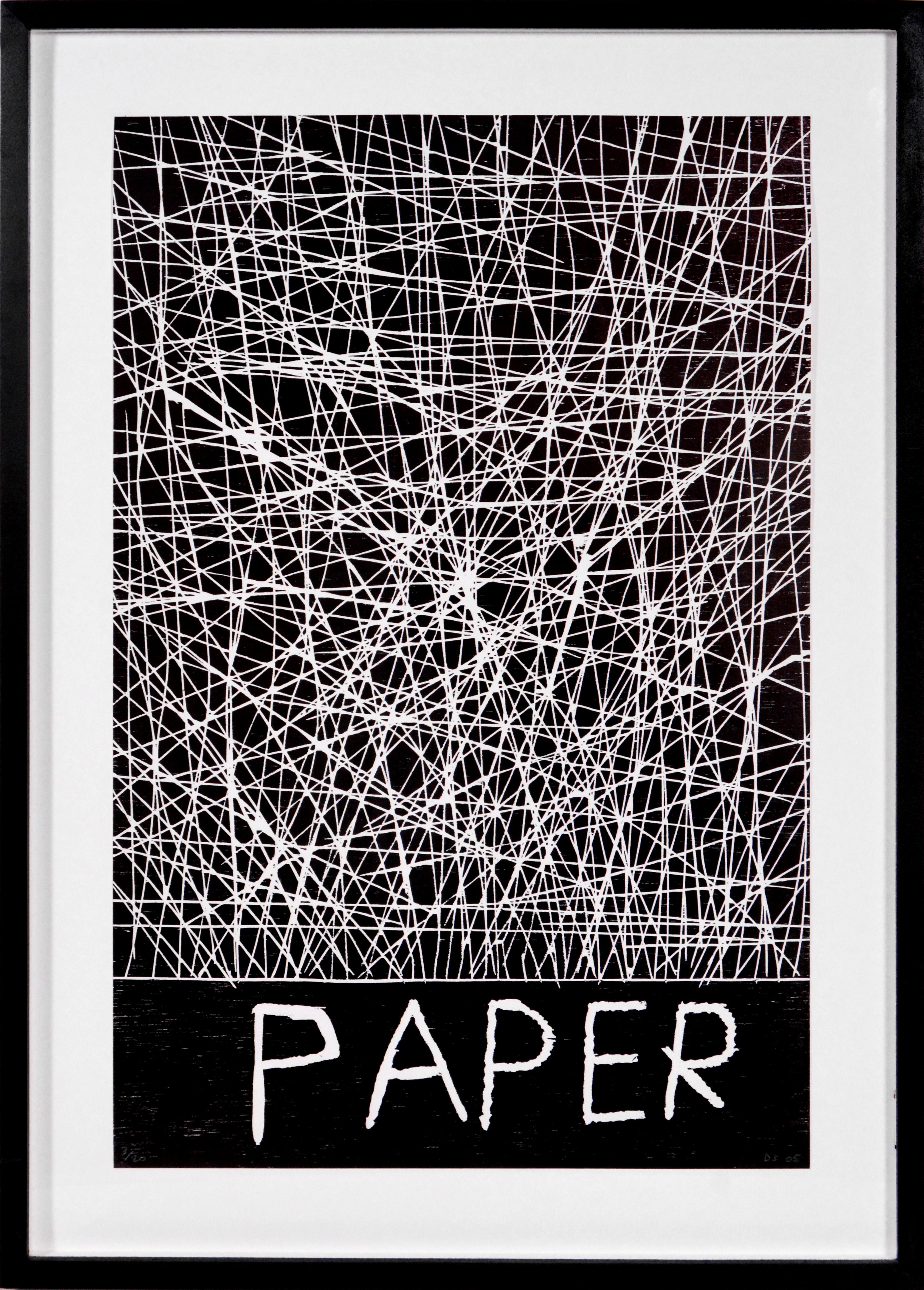
- PaperBy David ShrigleyLocated in London, GBWoodcut, 2005, on wove paper, signed, dated and numbered from the edition of 20 in pencil, published by Galleri Nicolai Wallner, Copenhagen, sheet: 59.7 x 39.7 cm. (23.5 x 15.6 in.)Category
Early 2000s Pop Art Still-life Prints
MaterialsWoodcut
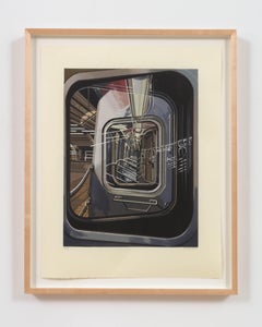
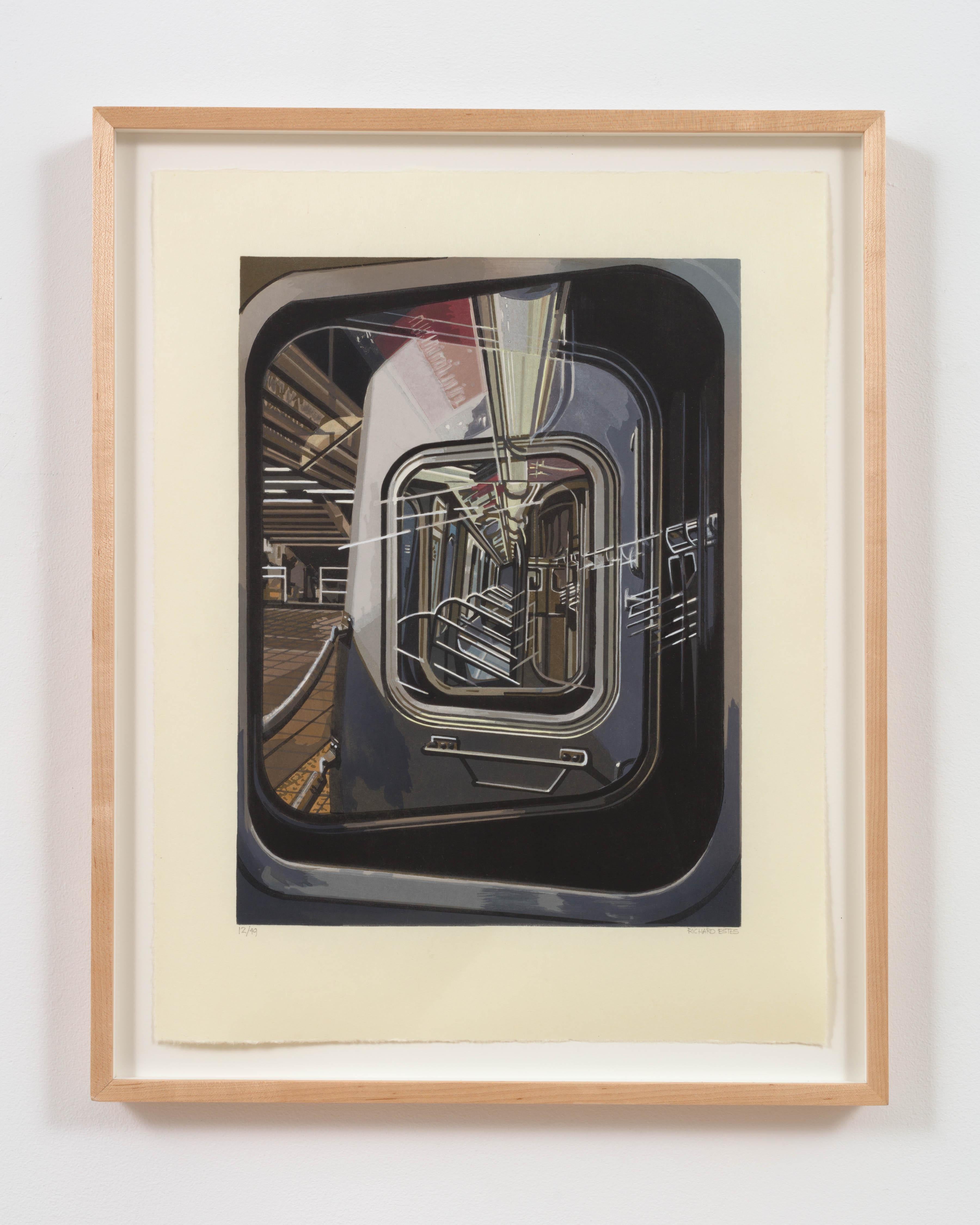
- The L TrainBy Richard EstesLocated in New York, NYRichard ESTES The L Train, 2017 Woodcut, ed. of 49 image: 16 x 12 inches sheet: 21 x 16 inchesCategory
2010s Photorealist Prints and Multiples
MaterialsWoodcut
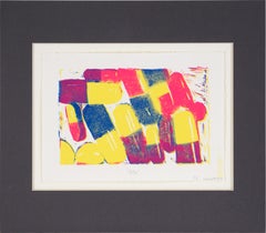
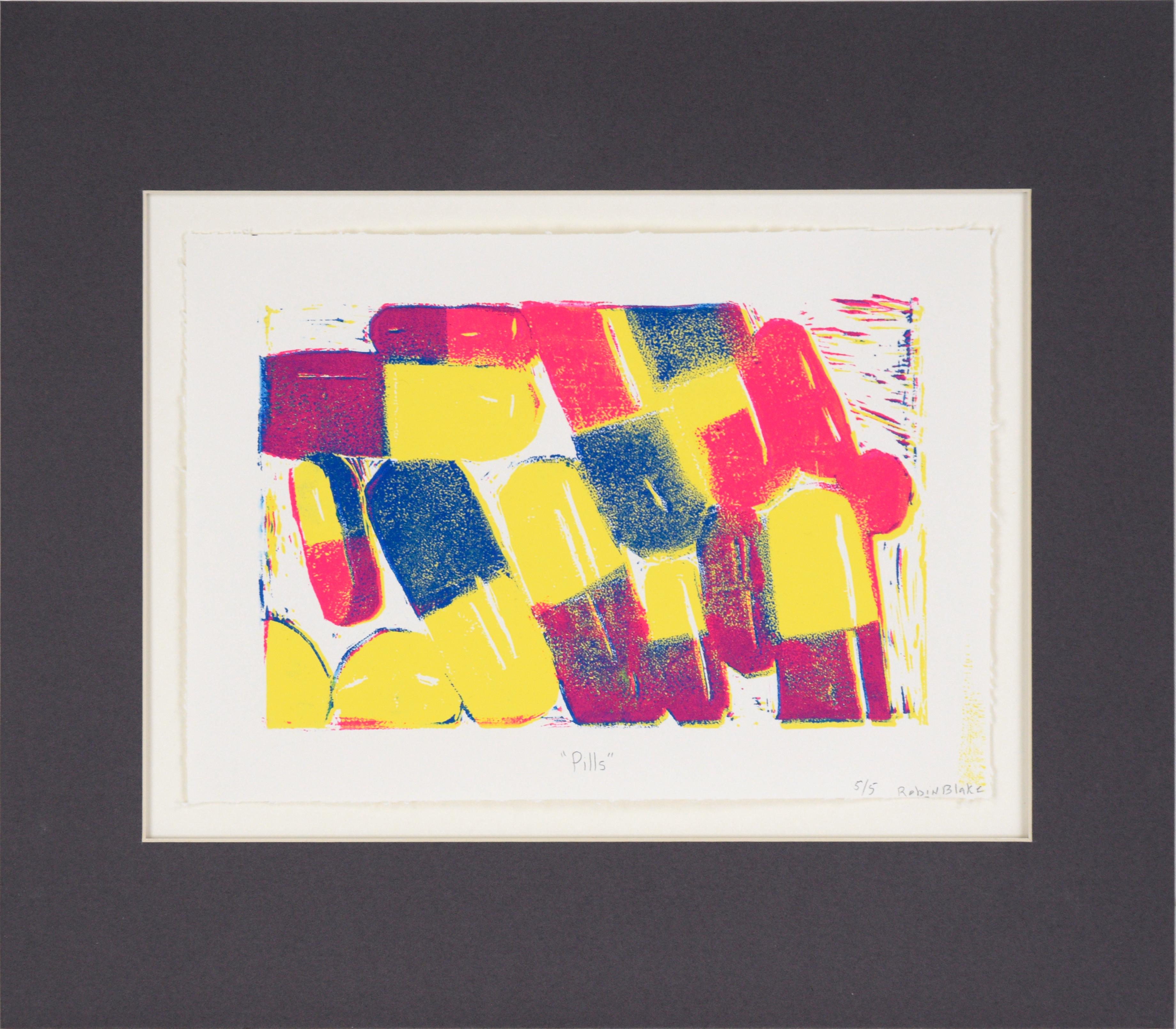
- "Pills" - Outsider Pop Art - Woodblock on Paper (#5/5)Located in Soquel, CAVibrant multi-layer woodblock print by Robin Blake (American, 1955). Three layers of neon ink (yellow, magenta, and blue) form a zoomed-in composition of pills. The bright colors cre...Category
2010s Outsider Art Still-life Prints
MaterialsPaper, Ink, Woodcut
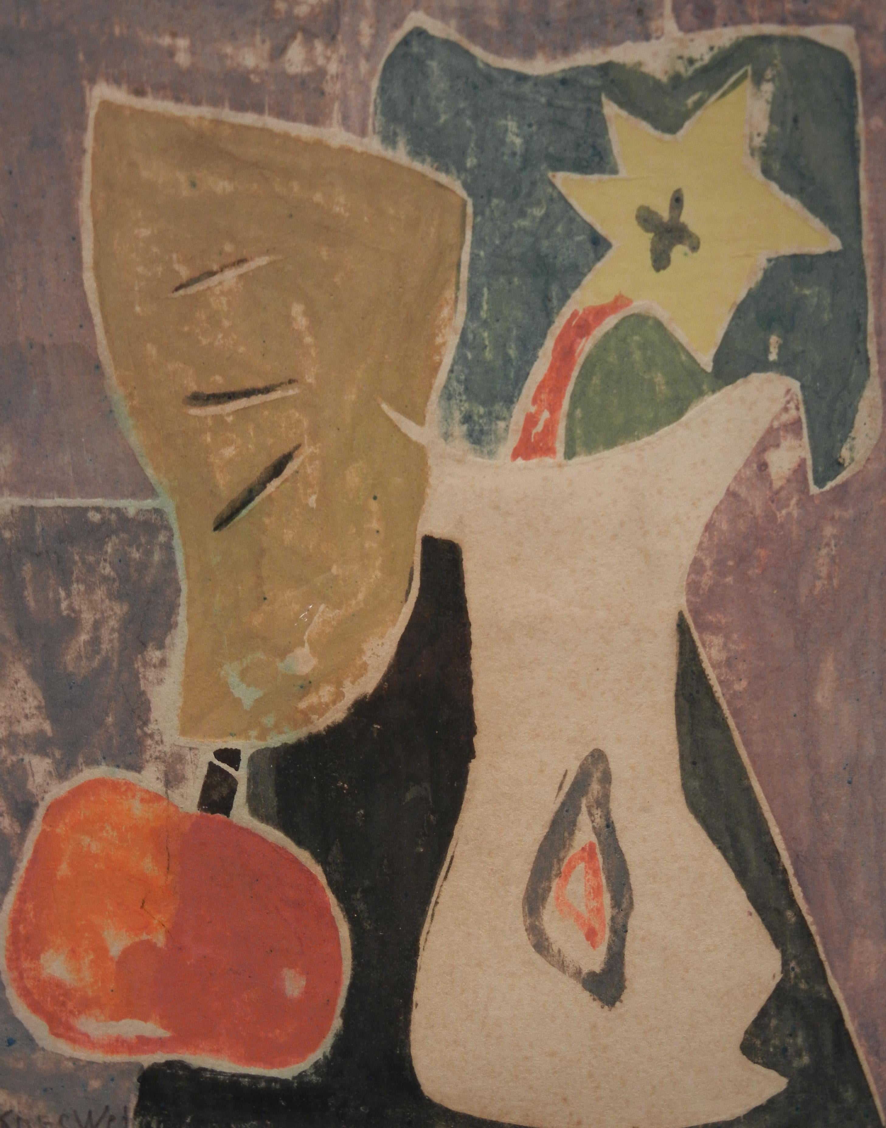
- Floral Still LifeLocated in Provincetown, MAAgnes Weinrich was born in Burlington, Iowa in 1873. She studied with French Cubist Albert Gleizes in Berlin, Paris, and Rome, and with Charles Webster Hawthorne and Blanche Lazzell in Provincetown, Massachusetts. In the 1920s, she organized and directed the first association for female painters in the United States, the New York Society of Women Painters. She was a founder of the Modernist Movement at the Provincetown Art Association. She exhibited in museums in Washington, DC, Boston, New York City, and elsewhere. Her work is highly sought after because she was one of the earliest American Modernist artists. She lived in Provincetown until her death in 1946. This undated white line woodcut print...Category
Mid-20th Century Abstract Impressionist Still-life Prints
MaterialsWoodcut